ABB
Presenting new drive differently. Technical details and informational data brought together the most minimalistic way.

McCann Helsinki was provided with an opportunity to present ABB’s new drive slightly differently than usual. Discussions with 3D-designer and front-end developer started in early stage so that concept was clear.
Project was supposed to be completed fairly quickly. 3D-parts took the most of the time but design was straight forward and quickly done when all needed materials were provided.
Design, imagery and development needed to put together in a matter of weeks and creating 3D images took most of the time. Hence design and development were executed quickly.
Presenting technical device differently
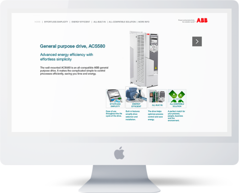
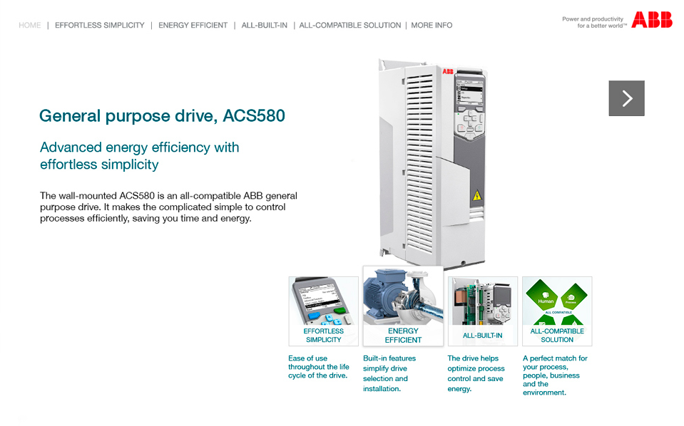
Compared to previous drives on ABB’s website, this landing page or miniature site was dedicated completely to present the device differently.

Simplicity as the main focus point
Like the ACS580 drive’s introduction says, effortless simplicity was needed to be brought out and try to showcase the drive as an efficient but simple device to use.

Clickable control panel
Easy to execute with a couple selected screens but an effective way to give insight of the new control panel and show examples of what had changed compared to older models.

Animated imagery through the drive
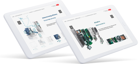
While navigating further, components are brought to the viewer with an "exploding" model. Inspecting the components and hardware the way every engineer would appreciate.

Layout overviews

First project to give the push towards user interface design and technological interest
Results & thoughts
This project might be and older one but it made a difference to me and gave a push towards a new direction on my career path. As a result I got more interested in UIs, technical aspect and user experience.